Accessibility
Color Contrast for Accessibility: Why 4.5:1 Is the Standard and How to Meet It
By Robert Belkin, Founder & Lead Strategist
Published · Reviewed by Robert Belkin · 6 min read
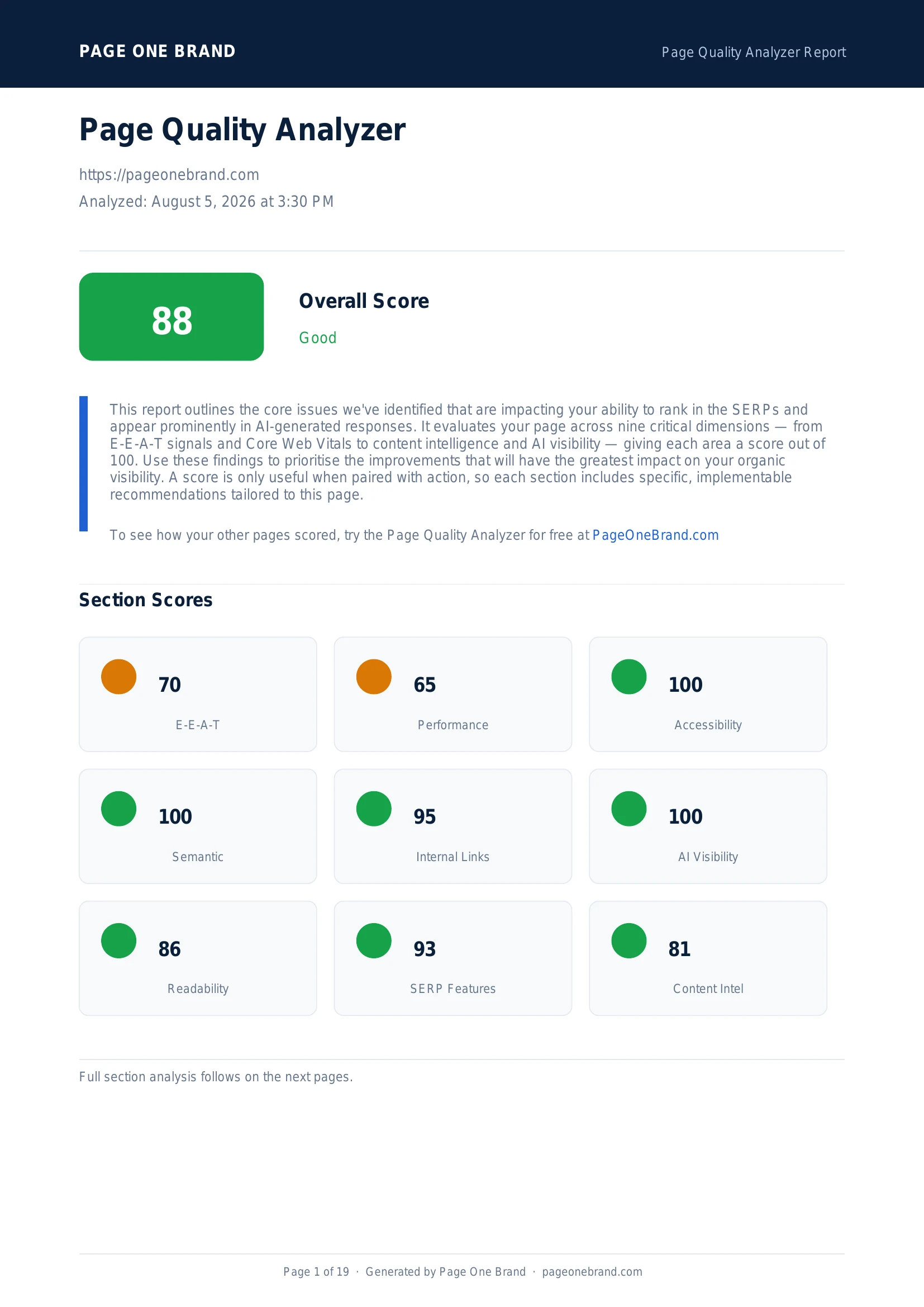
Color contrast is one of the most commonly failed accessibility checks — and one of the most fixable. Low contrast between text and its background makes content difficult or impossible to read for users with low vision, color blindness, or anyone using a screen in bright sunlight. WCAG 2.1 defines the minimum ratio clearly: 4.5:1 for normal text, 3:1 for large text. Lighthouse flags violations automatically, naming the exact elements and the contrast ratios that need adjustment.
Understanding Contrast Ratios
A contrast ratio is a number between 1:1 (no contrast — identical colours) and 21:1 (maximum contrast — pure black on pure white). It is calculated from the relative luminance of the foreground and background colours using a formula defined in the WCAG specification.
The thresholds from WCAG 2.1 Level AA:
Normal text (below 18pt regular weight or 14pt bold): minimum 4.5:1. This applies to most body text, labels, descriptions, and UI copy.
Large text (18pt and above regular weight, or 14pt and above bold): minimum 3:1. Large text is easier to read at lower contrast because the letterforms are larger.
WCAG Level AAA (enhanced accessibility): 7:1 for normal text, 4.5:1 for large text. AAA is aspirational and a higher bar than most legal requirements mandate.
The Accessibility section of a Page Quality Analyzer report — contrast violations are listed with the specific failing elements, making it easy to identify exactly which colours need adjusting.
Common Contrast Failures in Practice
Light gray text on white backgrounds. A common design pattern: using a muted colour like #999999 or #AAAAAA for secondary text on a white background. Both of these fail the 4.5:1 threshold. #767676 is the lightest gray that passes at 4.5:1 on white.
Coloured text on lightly tinted backgrounds. Brand colour badges are a frequent offender. A blue label (#2563EB) on a light blue background (#DBEAFE) produces a ratio of roughly 2.5:1 — failing by nearly half. The fix is usually to darken the text colour, lighten the background, or use a different combination that achieves contrast without sacrificing the visual design.
White text on medium-brightness brand colours. Mid-tone brand colours like coral, teal, or gold often fail to provide 4.5:1 contrast against white text. Darker shades of those brand colours work; medium shades often do not.
Placeholder text in form inputs. Placeholder text is frequently styled at very low contrast to look subtle. Since placeholder text carries information (it tells users what to type), it must meet the same contrast requirements as other text.
How to Measure Contrast Ratios
Chrome DevTools: Right-click any text element, select Inspect, and click the colour swatch in the CSS panel. DevTools shows the computed contrast ratio for that text against its background, with a pass/fail indicator for AA and AAA.
WebAIM Contrast Checker: Enter foreground and background hex values, get the ratio, and adjust values interactively until you reach the threshold. Useful when choosing colours at design time.
The Page Quality Analyzer: The Accessibility section lists every failing element from the Lighthouse audit, including the element's CSS selector — exactly what you need to find the offending elements in your codebase.
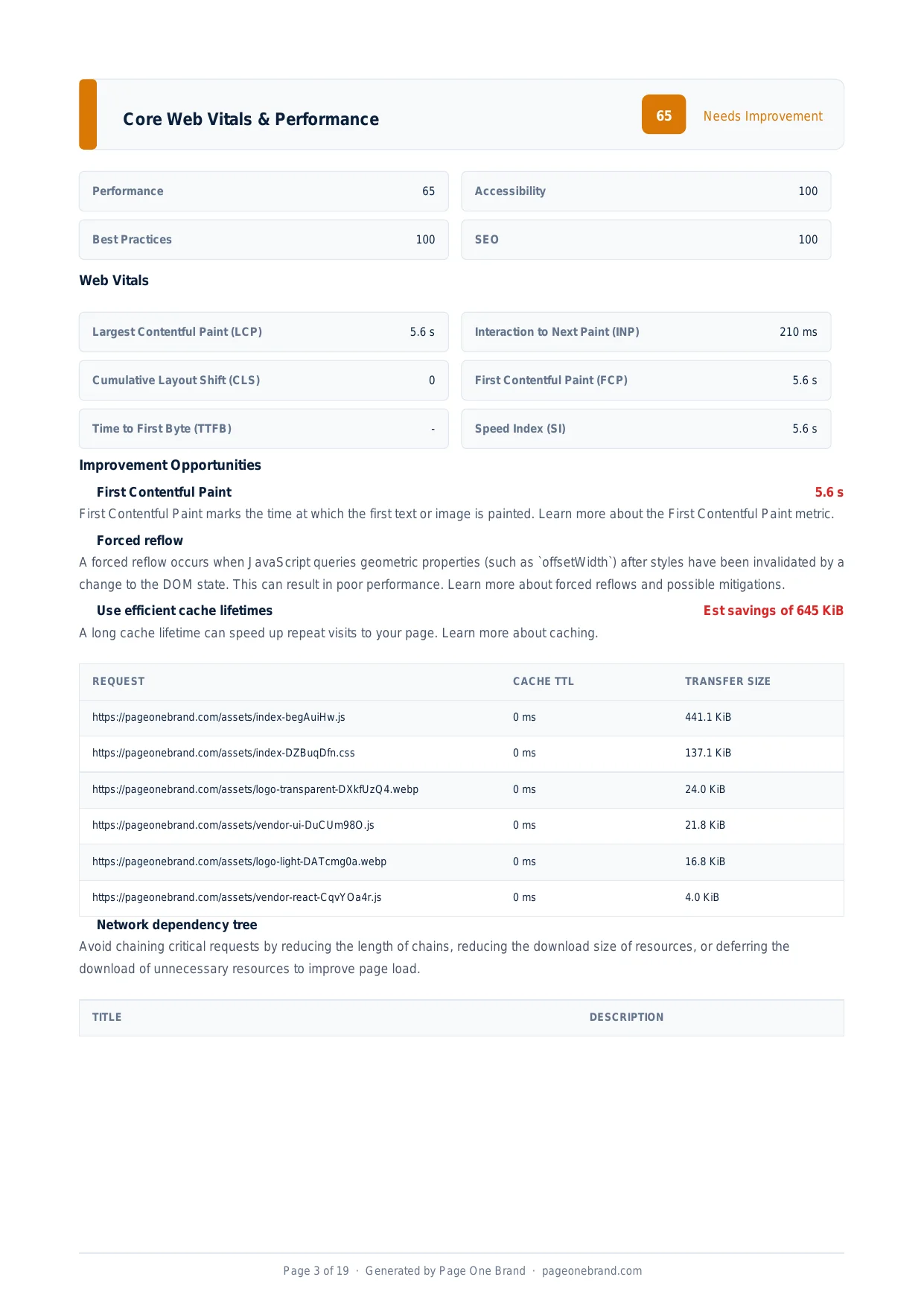 The Page Quality Analyzer runs both performance and accessibility audits in the same scan — addressing contrast failures improves your Accessibility score without affecting other dimensions.
Fixing Contrast Issues Without Redesigning
Most contrast fixes are smaller adjustments than they appear. You rarely need to change your colour palette entirely — you adjust the specific shade used for text or background in the failing context.
Darken the text colour. If secondary text is #999 on white, change it to #767676 (the minimum passing gray) or #666 (more safely passing). The visual difference is subtle. The contrast improvement is meaningful.
Darken the background of coloured badges. Instead of light blue background with blue text, use a slightly darker blue background with white text — often a higher-contrast and more visually polished result anyway.
Add a text shadow or outline. For text overlaid on photographs or gradient backgrounds where the background colour is not fixed, a subtle text shadow can boost effective contrast without changing the design.
Accessibility and good design are not in conflict. The WCAG contrast requirements align closely with basic readability principles — text that has sufficient contrast for users with low vision is also easier to read for everyone, in every light condition.
Frequently Asked Questions About Color Contrast
What are the WCAG contrast ratio requirements for normal text and large text?
WCAG 2.1 Level AA sets a minimum contrast ratio of 4.5:1 for normal text — body text, labels, UI copy, and any text below 18pt at regular weight or 14pt at bold weight. Large text (18pt and above at regular weight, or 14pt and above at bold) has a lower minimum of 3:1 because larger letterforms are easier to read at lower contrast. WCAG Level AAA — an enhanced standard beyond what most regulations require — sets thresholds of 7:1 for normal text and 4.5:1 for large text. Lighthouse checks against the AA standard, which is the requirement under WCAG conformance claims and accessibility regulations in most jurisdictions.
What tools can I use to check and fix color contrast issues?
Three tools cover the main use cases. Chrome DevTools: right-click any text element, select Inspect, and click the colour swatch in the CSS panel — DevTools shows the computed contrast ratio with a pass/fail indicator for both AA and AAA levels. WebAIM Contrast Checker (at webaim.org): enter foreground and background hex values to see the ratio and adjust them interactively until you reach the target threshold — useful during design to choose compliant colours before implementation. Lighthouse, accessible through the Page Quality Analyzer or Chrome DevTools Audits panel: the Accessibility section lists every failing element from an automated contrast audit, including the CSS selector, so you can find and fix each violation in your codebase.
What is the lightest gray that passes the 4.5:1 contrast ratio on a white background?
The lightest gray that passes the 4.5:1 contrast ratio requirement on a pure white (#FFFFFF) background is #767676. Any gray lighter than this — including commonly used muted text colours like #999999 or #AAAAAA — fails the WCAG AA requirement for normal text. This is a common failure because light gray on white is a popular design pattern for secondary or placeholder text. The visual difference between #767676 and #999999 is subtle to most sighted users with typical vision, but the accessibility difference is significant for users with low vision. Using #666666 provides additional margin above the threshold.
Does placeholder text in form inputs need to meet contrast requirements?
Yes. Placeholder text must meet the same 4.5:1 contrast ratio requirement as other normal text. Placeholder text is frequently styled at very low contrast — often #AAAAAA or similar — to convey its provisional, disappearing-on-input nature. But since placeholder text carries meaningful information (it tells users what format to enter or what the field is for), it must be readable. The conventional workaround — using a floating label or a permanent label element alongside the input rather than placeholder alone — is both more accessible and more usable, since labels remain visible after the user starts typing rather than disappearing as placeholders do.
Editorial implementation brief · Accessibility
A contrast review that catches more than body text
Contrast is a relationship between foreground and background, including states and boundaries. Review the complete component, not only the default paragraph colour.
What to check, in order
- Test normal text at 4.5:1 and large text at 3:1 under WCAG 1.4.3.
- Test icons, input borders, charts, and focus indicators at 3:1 when they communicate information under WCAG 1.4.11.
- Check hover, focus, disabled, error, and visited states; a passing default state does not make a failing focus state accessible.
- Pair colour with text, shape, or an icon so colour is never the only way to identify an error or status.
- Retest real text over gradients and images at the breakpoint where the background changes.
Copy-paste example
:root {
  --ink: #17324d;
  --ink-muted: #48647a;
  --focus: #005fcc;
  --surface: #ffffff;
}

.muted-copy { color: var(--ink-muted); } /* measure this pair */
:focus-visible {
  outline: 3px solid var(--focus);
  outline-offset: 3px;
}
Evidence from our workflow
Our repeatable check records the exact foreground/background pair, the component state, and the ratio from a WCAG-capable checker. We keep a screenshot of the failing state so a colour change can be reviewed without relying on memory or a passing desktop screenshot.
Primary sources
Editorial note: This guide was written by Robert Belkin, Founder & Lead Strategist at Page One Brand, and technically reviewed by Robert Belkin on August 25, 2026. See the author profile, scoring methodology, and contact page for supporting business and editorial information.