Core Web Vitals & Performance
How to Optimise Image Size for Web Performance Without Sacrificing Quality
By Robert Belkin, Founder & Lead Strategist
Published · Reviewed by Robert Belkin · 7 min read
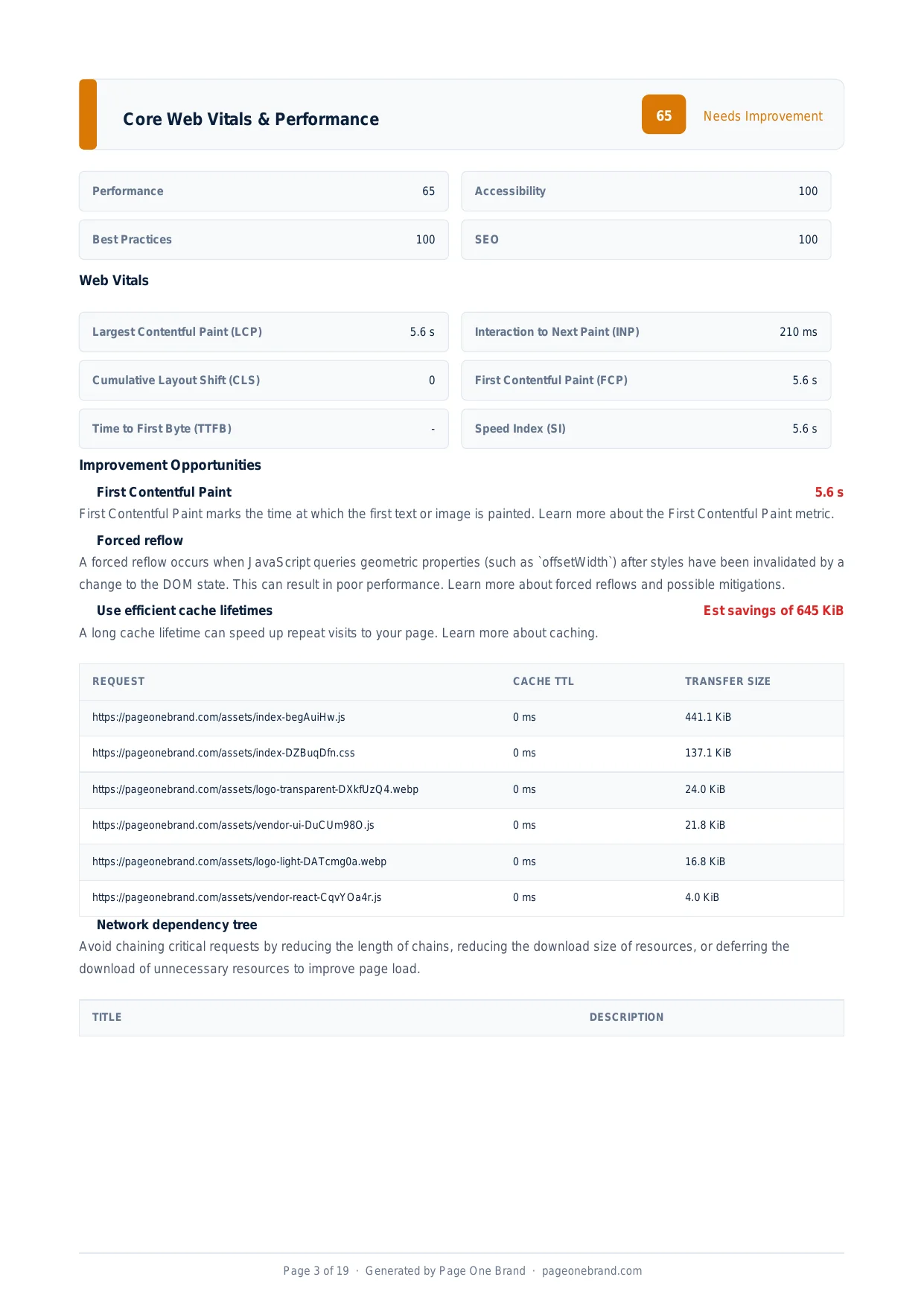
Images are the single most common cause of slow page loads. They are large, they are often unoptimised, and they are frequently served in the wrong format at the wrong size. The Lighthouse image delivery audit identifies images where the potential savings are measurable — and in most cases, fixing them requires no code changes beyond different export settings and a loading attribute.
Why Image Size Matters So Much
Images directly affect two of the most important performance metrics. The Largest Contentful Paint (LCP) element is an image on most pages — a hero banner, a featured product shot, a blog post thumbnail. The time for that image to finish downloading is added directly to LCP. A 200 KiB JPEG that takes 2 seconds to download on a mobile connection adds 2 seconds to LCP, regardless of how fast everything else on the page is.
Beyond LCP, large images consume bandwidth that could go towards faster JavaScript and CSS loading. The fix is not to use no images — it is to use images at the right size, in the right format, with the right loading strategy.
The Improve Image Delivery opportunity shows the specific image URL, estimated savings, and current transfer size — sorted so you can tackle the biggest wins first.
Modern Image Formats: WebP and AVIF
WebP was developed by Google and delivers 25 to 34% smaller file sizes than JPEG at equivalent visual quality. It supports both lossy and lossless compression, and transparency (replacing PNG for images that need an alpha channel). Browser support is universal — every browser in active use supports WebP.
AVIF is based on the AV1 video codec and delivers 40 to 50% smaller files than JPEG at equivalent quality. It supports HDR, wide colour gamut, and transparency. For maximum compatibility, serve AVIF with a WebP fallback:
<picture>
  <source srcset="hero.avif" type="image/avif">
  <source srcset="hero.webp" type="image/webp">
  <img src="hero.jpg" alt="Hero image">
</picture>
For sites that do not want the complexity of multiple source elements, serving WebP universally is a safe, high-impact choice. Tools like Sharp, Squoosh, ImageMagick, and most image CDNs can convert JPEG and PNG to WebP automatically.
Serve Images at the Right Dimensions
A common mistake is serving full-resolution images regardless of how they are displayed. A 4000x3000 pixel photograph displayed at 400x300 pixels is serving 10 times more pixels than the browser can show. The browser must download all the data, decode the full image, then scale it down — wasting bandwidth, decode time, and memory.
The srcset attribute solves this with responsive images:
<img
  src="hero-800.webp"
  srcset="hero-400.webp 400w, hero-800.webp 800w, hero-1600.webp 1600w"
  sizes="(max-width: 600px) 400px, (max-width: 1200px) 800px, 1600px"
  alt="Hero image"
>
The browser uses the sizes attribute to determine what size the image will be displayed at the user's viewport width, then downloads the smallest version that covers that size.
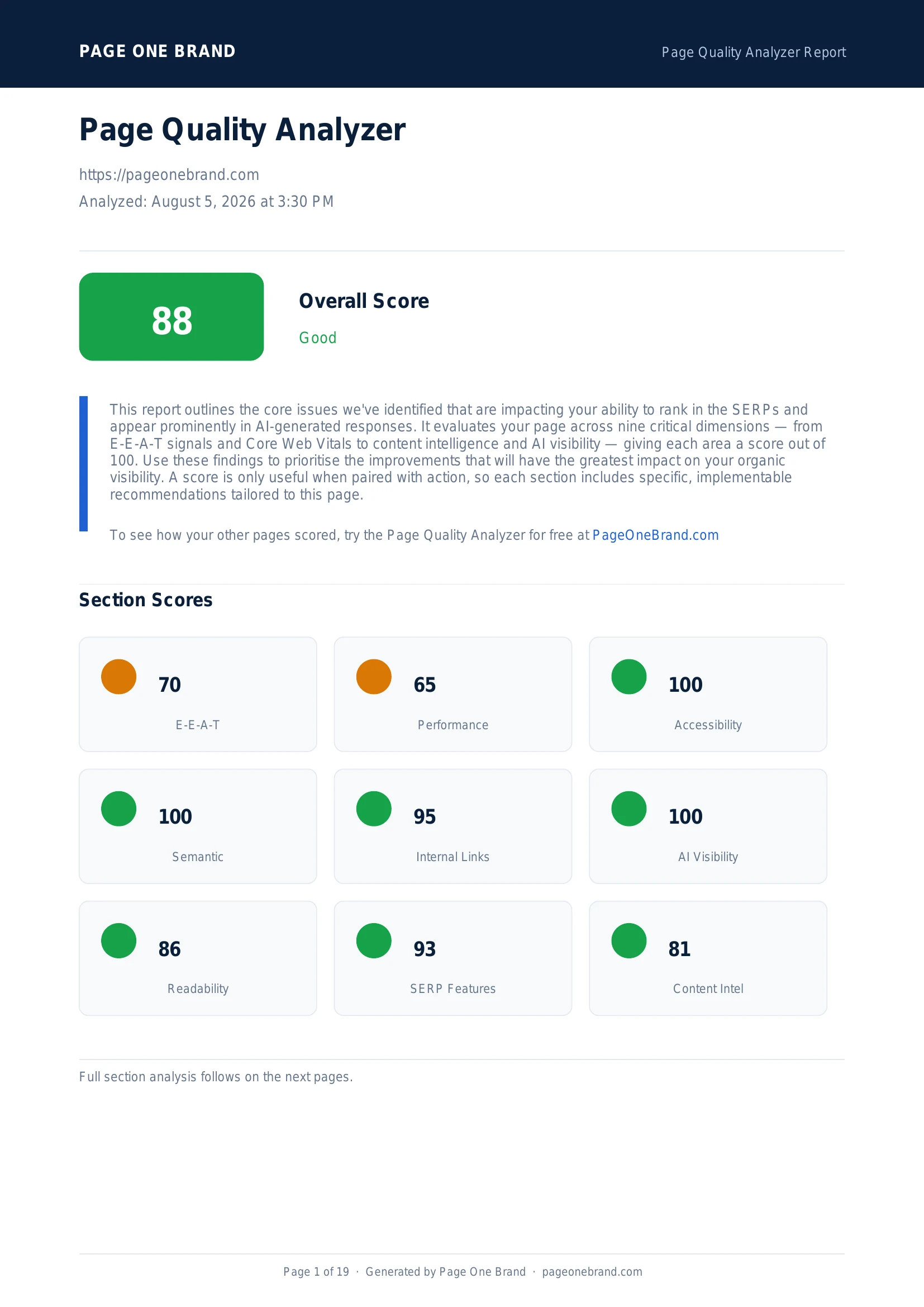 Image optimisation affects LCP, Speed Index, and the overall Performance score simultaneously — it is one of the highest-leverage performance changes available.
Lazy Loading and Priority Hints
Adding loading="lazy" to images not in the initial viewport tells the browser not to download them until the user scrolls close to them. This reduces network activity during initial page load, improving FCP and LCP by leaving more bandwidth for critical resources.
Critical exception: never add loading="lazy" to the LCP image. The LCP image needs to start downloading as early as possible. Only images below the initial viewport should be lazy-loaded. The image at the top of the page should load eagerly (the default) with a fetchpriority="high" attribute:
<img src="hero.webp" fetchpriority="high" alt="Hero">
Specify Width and Height to Prevent Layout Shift
When an image does not have explicit width and height attributes, the browser does not know how much space to reserve. When the image loads, it pushes content below it down the page — contributing to Cumulative Layout Shift (CLS). Set explicit dimensions even for responsive images:
<img src="hero.webp" width="1600" height="900" alt="Hero" style="width: 100%; height: auto">
Combined — WebP format, correct dimensions, lazy loading for off-screen images, and proper aspect ratio attributes — image optimisation consistently delivers the largest single improvement in Performance scores for content-heavy sites. Run the Page Quality Analyzer before and after to see the impact.
Frequently Asked Questions About Image Optimisation
What is the difference between WebP and AVIF, and which should I use?
WebP, developed by Google, delivers 25 to 34% smaller file sizes than JPEG at equivalent visual quality and has universal browser support across all browsers in active use. AVIF, based on the AV1 video codec, delivers 40 to 50% smaller files than JPEG — a meaningful further improvement over WebP — and also supports HDR, wide colour gamut, and transparency. The recommended approach is to serve AVIF to browsers that support it and WebP as a fallback using the picture element with multiple source elements. If you want to simplify the implementation, serving WebP universally is a safe, high-impact choice that most image CDNs and build tools support automatically.
How does the srcset attribute help with image performance?
The srcset attribute allows the browser to choose the appropriately sized image variant for the current viewport and display density, rather than downloading a full-resolution image on every device. A 4000px image served on a 400px mobile screen is ten times larger than necessary — the browser downloads all the data, decodes the full image, then scales it down. With srcset, you provide multiple image files at different widths, and the browser selects the smallest version that covers the displayed size. Combined with the sizes attribute — which tells the browser how large the image will be displayed at each viewport width — srcset prevents oversized image downloads on every device type.
When should I use loading="lazy" on images and when should I avoid it?
Apply loading="lazy" to images that are not visible in the initial viewport — blog thumbnails below the fold, gallery images that appear after scrolling, and any image that users only see after scrolling down. This defers those downloads until the user scrolls close to them, leaving bandwidth available for critical above-the-fold resources during initial page load. Never apply loading="lazy" to the LCP image — the largest element in the initial viewport. The LCP image needs to start downloading as early as possible, and lazy loading intentionally delays it. The LCP image should instead have fetchpriority="high" to signal to the browser that it should be downloaded before other images.
Why do images without explicit width and height attributes hurt CLS?
When an image does not have explicit width and height attributes, the browser does not know how much space to reserve in the layout before the image loads. It allocates zero space initially, and when the image loads, it pushes all the content below it down the page. This movement is measured by Cumulative Layout Shift (CLS) — one of the Core Web Vitals — and high CLS signals a poor user experience. Adding width and height attributes allows the browser to reserve the correct space immediately, preventing the shift entirely. Even for responsive images that are styled with CSS to be fluid, explicit dimensions should be set — the browser uses the aspect ratio (width divided by height) to calculate the correct space to reserve.
Editorial implementation brief · Performance
An image optimisation checklist that protects quality and LCP
The fastest image is the one the browser does not download, followed by the smallest correctly sized image it does download. Optimise the candidate list and the delivery path together.
What to check, in order
- Resize at the source to the largest rendered slot; do not ship a 2400px image into a 400px card.
- Serve AVIF or WebP with a fallback where needed and compare visual quality at the actual display size.
- Use
srcset and sizes so the browser chooses a candidate for the viewport. - Lazy-load below-the-fold images, but do not lazy-load the LCP image.
- Set width and height (or an aspect ratio) to reserve space and prevent layout shifts.
Copy-paste example
<picture>
  <source srcset="/hero-640.avif 640w, /hero-1280.avif 1280w"
          type="image/avif">
  <source srcset="/hero-640.webp 640w, /hero-1280.webp 1280w"
          type="image/webp">
  <img src="/hero-1280.jpg"
       sizes="(max-width: 720px) 100vw, 50vw"
       width="1280" height="720"
       alt="Product dashboard">
</picture>
Evidence from our workflow
We compare the selected candidate’s intrinsic dimensions, transferred bytes, visual quality, and LCP/CLS effect at the same viewport. This catches the common “converted format, but still oversized” failure mode.
Primary sources
Editorial note: This guide was written by Robert Belkin, Founder & Lead Strategist at Page One Brand, and technically reviewed by Robert Belkin on August 25, 2026. See the author profile, scoring methodology, and contact page for supporting business and editorial information.