Accessibility
Prohibited ARIA Attributes: Why Putting aria-label in the Wrong Place Breaks Screen Readers
By Robert Belkin, Founder & Lead Strategist
Published · Reviewed by Robert Belkin · 6 min read
ARIA — Accessible Rich Internet Applications — is a set of HTML attributes that allow developers to communicate the purpose and state of UI elements to assistive technologies like screen readers. Used correctly, ARIA transforms otherwise opaque custom components into understandable, navigable interface elements. Used incorrectly — particularly by applying attributes to roles that explicitly prohibit them — ARIA can actively confuse screen readers, causing them to misrepresent or ignore important information.
What Prohibited ARIA Attributes Means
The WAI-ARIA specification defines which ARIA attributes are allowed, required, or prohibited for each role. Prohibited means the specification explicitly says that attribute must not be used on elements with that role, because its presence conflicts with how assistive technologies interpret the role.
A concrete example: aria-label on a div with a role that does not support naming. If you have a star-rating component built from div elements with aria-label="5 out of 5 stars" applied to each individual star, the role may not support naming via aria-label — causing screen readers to either ignore the label entirely, or to announce it in a way that makes no sense in context.
This is particularly subtle because aria-label is often added with good intentions — the developer knows the element needs a label and adds one — but the combination of element type, implicit role, and attribute is semantically invalid per the specification.
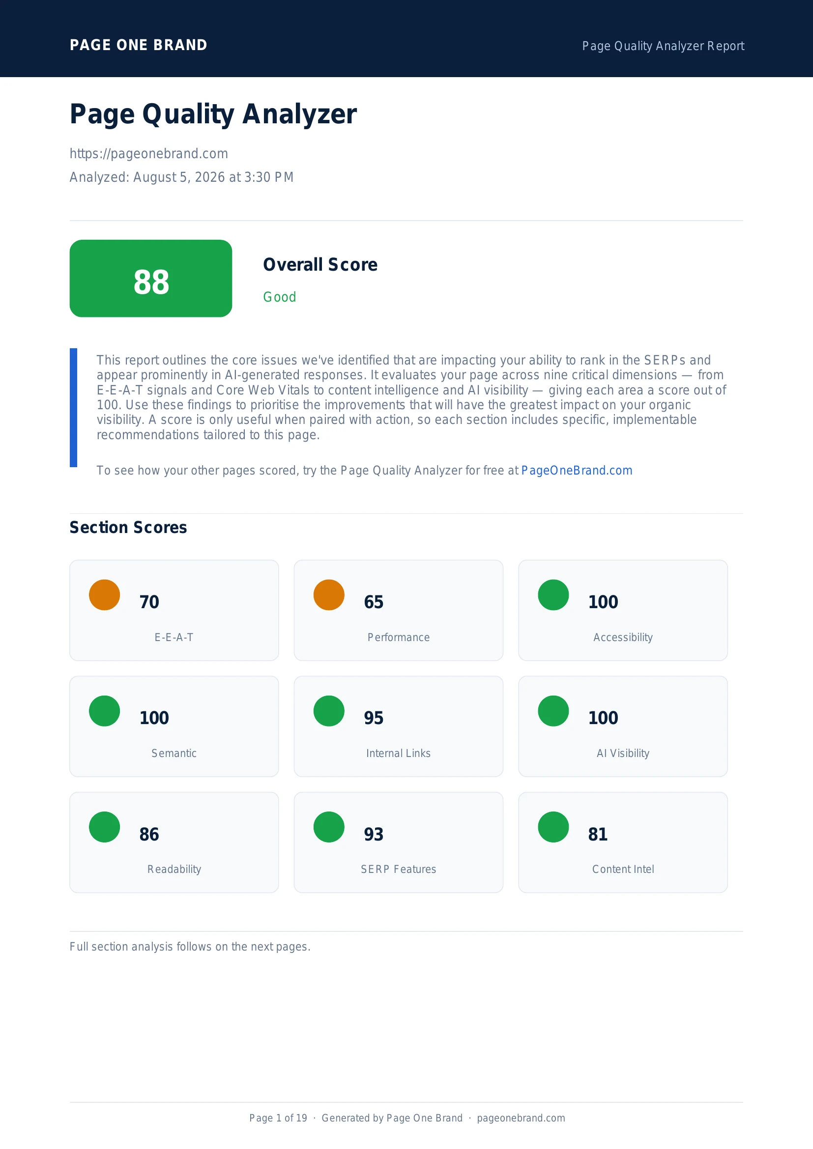
The Accessibility section of a Page Quality Analyzer report — ARIA violations appear grouped by category, with the specific failing elements so you can locate them in your code.
Why This Matters for Screen Reader Users
Screen readers like NVDA, JAWS, VoiceOver, and TalkBack rely on the ARIA role and attribute model to determine what to say and how to navigate. When an element has contradictory ARIA information — an attribute that is prohibited for its role — the screen reader's behaviour is undefined. Different screen readers handle it differently: some ignore the prohibited attribute, some announce it anyway, some produce unexpected output.
The first rule of ARIA: no ARIA is better than bad ARIA. An element with no ARIA attributes behaves predictably — screen readers use the native HTML semantics. An element with invalid ARIA has broken semantics. The Lighthouse audit specifically catches cases where ARIA is actively making accessibility worse.
Common Cases and How to Fix Them
aria-label on decorative or presentational elements. Elements with role="presentation" or role="none" should never have aria-label. The role says "ignore this"; the label says "announce this." They directly contradict each other. Remove aria-label from presentational elements, or change the role if the element is actually meaningful.
Star rating components. A common pattern: a row of star icons in div elements with aria-label="5 out of 5 stars" on each individual star. The fix is to apply the label to the container element and make individual stars decorative:
<div aria-label="Rating: 5 out of 5 stars" role="img">
  <span aria-hidden="true">★★★★★</span>
</div>
This gives the screen reader one meaningful element to announce instead of five confusing ones.
aria-label on elements with roles that do not support naming. Check the ARIA specification for the specific role to determine which naming mechanism is appropriate: aria-label, aria-labelledby, or a visible label element.
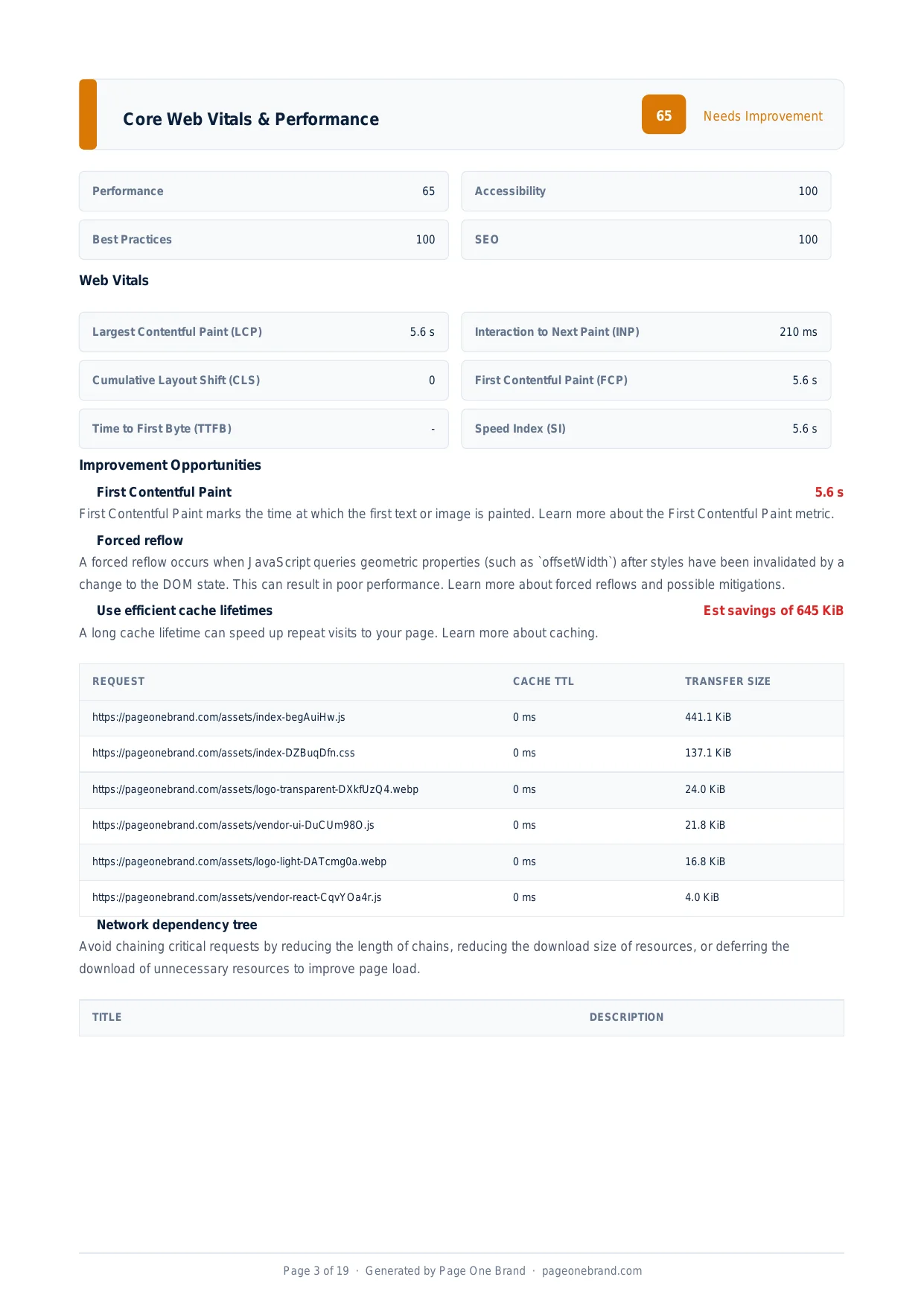 Accessibility fixes improve your overall score independently of performance — they are also required for legal compliance in many jurisdictions.
The Right Way to Use ARIA
The foundational principle: prefer native HTML semantics over ARIA whenever a native element exists for the purpose. A <button> is more accessible than a <div role="button"> because it is keyboard-focusable, activated by Enter and Space, and announced correctly by all screen readers by default. An <input type="checkbox"> is more accessible than a custom checkbox built from divs with ARIA attributes.
When native elements are insufficient — for custom components like sliders, date pickers, or tree views — use ARIA to bridge the gap. Check the WAI-ARIA specification and the ARIA Authoring Practices Guide to verify which attributes are allowed for your role before adding them.
Resolving the prohibited ARIA attributes audit in your Page Quality Analyzer report means you have moved from ARIA that confuses assistive technology to ARIA that correctly communicates intent — a meaningful improvement for users who depend on screen readers.
Frequently Asked Questions About Prohibited ARIA Roles
What does "prohibited ARIA attributes" mean in the Lighthouse accessibility audit?
The WAI-ARIA specification defines which ARIA attributes are allowed, required, or prohibited for each role. Prohibited means the specification explicitly says that attribute must not be used on elements with that role because its presence conflicts with how assistive technologies interpret the role. For example, aria-label on an element with role="presentation" or role="none" creates a direct contradiction: the role says "ignore this element" while aria-label says "announce this element." Screen readers handle this contradiction inconsistently across implementations — some ignore the prohibited attribute, some announce it in a way that makes no sense in context, and some produce unexpected output that confuses users relying on assistive technology.
Why is no ARIA better than bad ARIA?
The first rule of ARIA is that no ARIA is better than bad ARIA. An element with no ARIA attributes behaves predictably — screen readers use the native HTML semantics, which are well-understood and consistently implemented across assistive technology. An element with invalid or contradictory ARIA has broken semantics: the screen reader's behaviour becomes undefined and varies between implementations (NVDA, JAWS, VoiceOver, TalkBack all handle edge cases differently). ARIA added with good intentions — a developer knowing an element needs a label and adding one — can actively make the page harder to use for screen reader users when the combination of element type, implicit role, and attribute is semantically invalid per the specification. The Lighthouse audit specifically catches cases where ARIA is making accessibility worse rather than better.
What is the correct pattern for an accessible star rating component?
A common incorrect pattern is applying aria-label to each individual star element in a row of icons. The fix is to apply the label to a single container element and mark the individual stars as decorative with aria-hidden. The correct pattern: wrap the stars in a div with role="img" and aria-label="Rating: 5 out of 5 stars", then mark each individual star span with aria-hidden="true". This gives the screen reader one meaningful, clearly labelled element to announce instead of five confusing ones. The role="img" tells the screen reader to treat the group as a single image with a text alternative — which is exactly what a star rating represents semantically.
When should developers use ARIA instead of native HTML elements?
The foundational principle is to prefer native HTML semantics over ARIA whenever a native element exists for the purpose. A button element is more accessible than a div with role="button" because it is keyboard-focusable by default, activated by Enter and Space, and announced correctly by all screen readers without additional configuration. An input type="checkbox" is more accessible than a custom checkbox built from divs with ARIA attributes. ARIA is appropriate when native elements are genuinely insufficient for a custom component — complex widgets like sliders, date pickers, tree views, or comboboxes that have no native HTML equivalent. Before adding ARIA to a custom component, check the WAI-ARIA Authoring Practices Guide for the specific role to verify which attributes are required, optional, and prohibited.
Editorial implementation brief · Accessibility
A safe ARIA review: native element first, role second
ARIA changes the accessibility tree; it does not make an arbitrary element behave like a native control. Check the role’s supported states and properties before adding an attribute.
What to check, in order
- Use a native
<button>, <input>, <nav>, or heading where one expresses the meaning. - If a custom widget is necessary, choose the exact ARIA pattern and required keyboard behaviour from the Authoring Practices Guide.
- Check prohibited and unsupported properties for the role in the WAI-ARIA specification.
- Test with keyboard navigation and at least one screen reader; a passing static rule is not the whole user experience.
- Remove redundant labels from presentational content and use
aria-hidden="true" only for genuinely decorative descendants.
Copy-paste example
<button type="button" aria-expanded="false" aria-controls="filters">
  Filters
</button>
<div id="filters" hidden>
  ...
</div>
Evidence from our workflow
Our evidence record includes the element’s native semantics, explicit role (if any), accessible name, keyboard result, and the screen reader announcement. We do not “fix” a warning by adding more ARIA without checking the resulting interaction.
Primary sources
Editorial note: This guide was written by Robert Belkin, Founder & Lead Strategist at Page One Brand, and technically reviewed by Robert Belkin on August 25, 2026. See the author profile, scoring methodology, and contact page for supporting business and editorial information.